Some of the world’s most iconic logos are….confusing. How is a mermaid related to coffee? What does an apple have to do with computers? Why is a gold seashell the symbol for a fuel station? The story behind the PADI logo is more straightforward, but there is a surprising twist few people know about.
The Original PADI Logo — 1966
In 1966, PADI co-founder Ralph Erickson designed the first PADI Logo. The other co-founder, John Cronin, expressed his desire for a “classy” design, similar to National Geographic.
Erickson later said the process of creating the logo helped him see beyond their two-man operation and imagine a bigger future for PADI. Drawing inspiration from an image in Jacques Cousteau’s documentary The Silent World, Erickson sketched the diver-with-torch motif.
Weary after hours of arranging stick-on letters to make the logo, Erickson accidentally left out the “e” in “professional.” The error remained for two years until a PADI Member pointed out the mistake. Some of the misspelled originals are still on display at PADI’s California office.
Fun fact: PADI’s founders took inspiration from National Geographic’s logo, and today the two global leaders are working together to create more Marine Protected Areas (MPAs). It’s a full-circle moment that benefits coastal communities and our ocean planet.
A New Design for a New Vision — 2019
In 2019, PADI updated the company tagline from “The Way the World Learns to Dive®” to “Seek Adventure. Save the Ocean.” The new tagline came from PADI’s revised mission to create a billion torchbearers to explore and protect the ocean and its redefined vision to achieve balance between humanity and the ocean.
With the redefined tagline came a new iteration of the PADI Logo:
About the PADI Logo
The PADI logo has two distinct elements: a diver with the torch swimming through the globe and the word PADI in distinctive script with a registration mark. The colors represent the American origin of the company, but they also have a symbolic meaning.
- PADI Blue = The underwater world
- PADI Red = PADI’s safety standards
- PADI White = The premium experience offered by PADI Dive Shops and Professionals
- PADI Black = The company’s bold vision
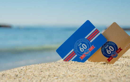
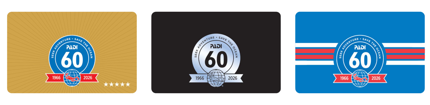
PADI’s 60th Anniversary Logo
PADI has a special anniversary logo to celebrate 60 years of helping people seek adventure and save the ocean. Keep an eye out for this limited-edition logo to pop up on our website, digital products, PADI swag and more.
Plus, in 2026, all standard PADI certification cards are issued with this commemorative 60th anniversary logo, making every new certification a small piece of PADI history. Whether you’re earning your very first certification or ordering a physical card to go along with an existing eCard, your card will feature this limited-edition design marking six decades of diver training, exploration and ocean protection.
Want to add the 60th anniversary card to your wallet? Order your certification card and carry a piece of PADI’s legacy with you on every dive.
PADI is also going on tour in celebration of this big anniversary! Click the button below to find out how to connect with PADI in 2026 (and maybe score some anniversary-themed swag or other prizes).